What’s in a brand?
At BFM, we are frequently presented with opportunities to express brands through various media platforms. Recently, we were given the challenge to design the beer brand for 4204 Main Street Brewery’s latest beers! As the brewery began to expand and open a second location, beer production was also increased in hopes of distributing products outside of 4204’s restaurants. Our goal was to design the beers with their own unique voice, that stand out on shelves and maintain the Main Street Brewery identity.

Breaking Out of the Restaurant
How did we bring 4204 Main Street brews from the tap to the shelf? In its natural setting, served in a pint glass or beer flight at the brewery, the beers’ only identity is its taste. For branding purposes, we needed a means to visually embody these brews in order to stand out from the ever increasing craft beer market; along with being recognizable as the quality product that 4204 Main Street brews. The concept had to be shifted from “love at first drink” to “love at first sight.”
From Planning to Design
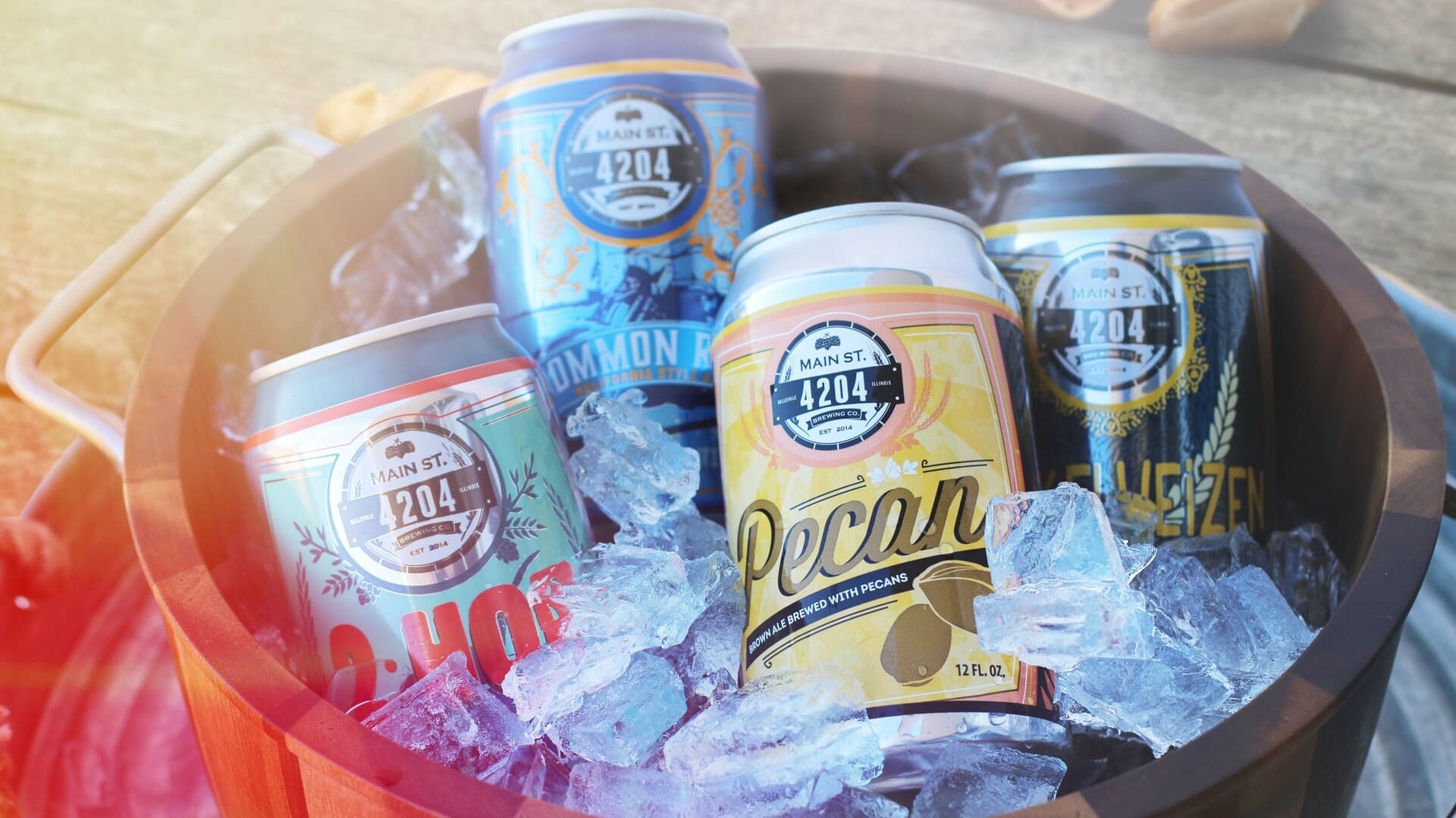
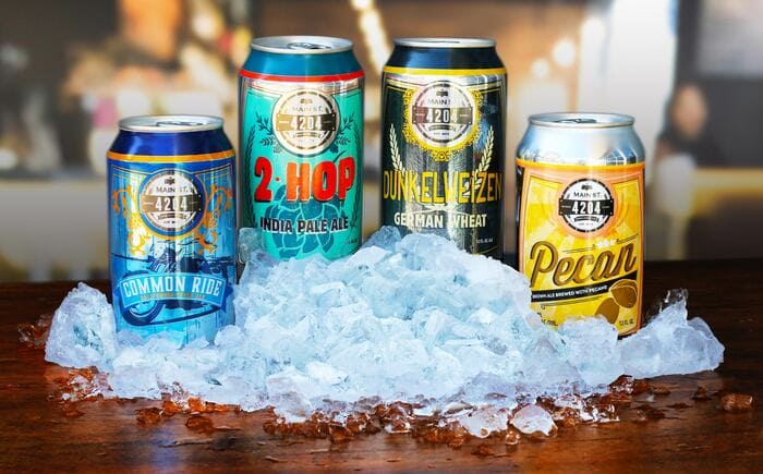
Our first task was finding a way for four separate designs to be identifiable under one brand. Though these beers have different names, colors, fonts, and illustrations on the label, they are still easily recognized as a product of the 4204 Main Street Brewery due to a few similarities. Each can may have different elements, but they all follow the same structure. Every can displays black and white photos of the restaurant, they all possess a bar of color at each cans peak, and they all have the logo front-and-center with each product name just below the logo. These similarities allow for the cans to be individual, but not so individual that consumers are unable to recognize the single beverages as part of the group.
So what makes these cans so unique?
When Main Street Brewery decided to take their beers to the local shelves, we wanted to make their design an extension of their successful restaurant, in which their recipe for success is to complement beers with meals that go well together. In other words, we wanted to pair each beer with a personalized packaging and design that gives them their own chance to stand out while keeping the branding cohesive. Although the beers have similar structures and placements of logo, tagline and illustrations; they have custom picked typography, color palette and graphics. This gives each beer it’s own personal identity while still resembling to the 4204 Main Street Brand.
2-Hop
The Two Hop India Pale Ale is a very well complemented beer, being both bitter and citrusy giving it a strong but clean taste. To implement these traits to the packaging, we opted for a complementary color palette that has enough contrast; with many light blues and cyans serving as background for a dominant red title. The subtle floral hop behind the thick title font symbolizes the essential ingredient they use to make the brew “hoppy” or bitter.
Pecan Brown Ale
One of the house favorites due to the particular use of pecans in the brewing process, the Pecan Brown Ale is a sweet-ish beer with hints of roasted pecans. Since we wanted to express this light bodied brown ale’s main ingredient, we went with a gold/golden color palette than blends well with the subtle brown used in both the title and the pecan. The cursive style font flows well with the rich and yellow background pattern.
Dunkelweisen German Wheat
This beer label was primarily aimed at show-casing a dark and wheat based brew. The “Dunkelweizen” title uses a bright and shinny yellow to highlight the German name and heritage of the brew. However, the most important aspect of this design are the simple but elegant wheat tillers that rest above a subtle black texture in the background. Finally, the thickness of the fonts helps emphasize the strong personality of this beer.
Common Ride California Ale
On the other hand, we have the Common Ride California Style Ale, which is a smooth and traditional American beer. This brew style uses rye to create a well-balanced taste, which we tried to replicate using elegant tones of light blue under a warm orange. Like in the “Dunkelweisen”, the Common Ride shows part of its heritage on the packaging, with a motorcycle over a coastal road and a color palette that resembles California. The fonts used are modern and stylish, which portrays how much newer and fresh American brewing traditions are in comparison with the more traditional and historic German beers.


0 Comments